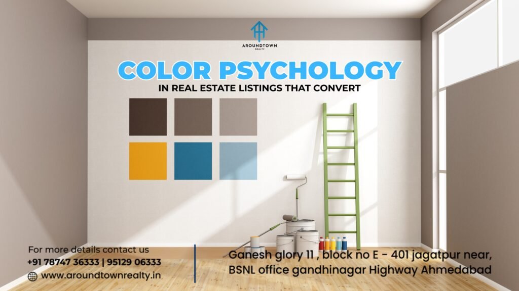
Introduction: Why Color Psychology Matters in Real Estate Listings
Colors aren’t just about aesthetics—they’re about emotion. In real estate, the colors you choose for staging, photography, or listing creatives can significantly influence buyer perception, engagement, and conversion. In fact, studies show that color influences up to 90% of snap judgments, and in a saturated market like Ahmedabad’s, where every flat seems to blend into the next, color can help yours stand out and sell faster.
In this blog, we explore the power of color psychology in real estate listings—from choosing the right palette to using colors to highlight features, create mood, and establish trust.
1. The Psychology of Color: A Quick Primer
Each color triggers a specific emotional response. Here’s how the most common ones influence buyer behavior:
- White: Clean, spacious, fresh, and open. Ideal for modern apartments and minimalist homes.
- Beige & Warm Neutrals: Safe, calming, and versatile. Encourages a homely, cozy vibe—great for family-oriented spaces.
- Blue: Trustworthy, serene, and stable. Works well for bedrooms or calm living areas.
- Green: Natural, healing, eco-conscious. Often used in garden-facing balconies or eco-friendly homes.
- Yellow: Cheerful, energetic, and optimistic. Adds warmth to kitchens or kids’ rooms.
- Gray: Sophisticated, neutral, and elegant. Suits upscale apartments, especially in luxury listings.
- Black: Dramatic and powerful, but must be used sparingly (like in modern kitchens or high-end fixtures).
- Red: Passionate and attention-grabbing. Effective for highlighting key areas, but should be used as an accent.
2. Color in Photography: The Buyer’s First Impression
When scrolling through property listings, color contrast and tone are what stop the scroll.
Tips:
- Use white or soft beige walls to create a feeling of space and brightness in photos.
- Avoid too many dark tones unless you’re showcasing luxury interiors.
- Natural lighting enhances warm colors—shoot photos during the golden hour (early morning or before sunset).
- Use a pop of color—like a blue sofa or green plant—to break monotony and anchor the photo.
Pro Tip for Ahmedabad Homes: Avoid overly yellow lighting in images—it can make spaces feel dated. Use daylight LED or edit photos to maintain color balance.
3. Color in Digital Listings & Brochures
When designing property brochures or online banners, the color palette sets the emotional tone for your brand.
What Works:
- Warm tones (beige, terracotta, muted orange) work well for suburban or cultural homes (think Shilaj, Bopal).
- Cool blues and grays suit urban, professional listings in SG Highway or Vastrapur.
- Greens and earth tones work great for eco-projects and garden-facing villas.
- Gold accents or royal blues for luxury penthouses in Bodakdev, Prahladnagar.
Make sure your call-to-action buttons (like “Schedule Visit” or “Know Price”) contrast with your background for better click-throughs. For instance, white text on a bold terracotta or emerald green CTA works wonders.
4. Color Psychology in Home Staging
What buyers see during a visit can validate (or ruin) their online impression. Staging with color in mind can significantly boost property appeal.
Staging Ideas:
- Use neutral base colors (white, ivory, dove gray) for walls to make spaces feel clean and larger.
- Add accent items like cushions, rugs, or wall art in calming blues or energizing yellows to set room moods.
- For balconies, use green plants and cane furniture to connect with Ahmedabad’s love for verandas.
- Avoid bold red or black walls unless the property is ultra-modern or themed.
Ahmedabad Reality Tip: Earth tones like clay, muted orange, and olive green resonate with cultural buyers and match the city’s heritage-inspired décor.
5. Color and Target Audience Matching
Different colors appeal to different buyer segments. Use this strategically in listings:
| Buyer Type | Ideal Colors | Why It Works |
| Young Professionals | Gray, Blue, Black Accents | Feels modern, stylish, urban |
| Families with Kids | Beige, Yellow, Light Green | Feels warm, happy, safe |
| Luxury Buyers | Navy, Gold, Rich Earth Tones | Evokes class, richness, timelessness |
| Elderly Buyers | Soft White, Cream, Pastels | Promotes calm, clarity, and comfort |
| NRIs or Global Buyers | White + Modern Bold Accents | Matches global tastes & sophistication |
6. Mistakes to Avoid in Color Strategy
Even with good intent, color can go wrong if not used thoughtfully.
Common Errors:
- Too much contrast in one room (e.g., red + black + orange)
- Using overpowering colors like neon green in key visual areas
- Photos with poor lighting that make colors look dull or dirty
- Using colors that clash with the property’s target segment
Stick to a maximum of 3-4 cohesive colors per room or listing for visual harmony.
7. Leveraging Color Psychology for Different Property Types
Not all properties require the same color strategy. The approach varies depending on the type of property, price range, and location.
a) Budget Apartments in Suburban Areas
In areas like Chandkheda, Naroda, or Gota, where price sensitivity is high and buyers seek “value for money,” color schemes must emphasize brightness, space, and comfort.
- Light neutral shades such as ivory, beige, and soft peach work well.
- Use pastel colors in kitchens or bedrooms to give a homely, inviting feel.
b) Premium Flats in SG Highway or Bodakdev
These areas attract upwardly mobile professionals and NRIs. The color palette should project modern sophistication.
- Opt for cool grays, charcoal, and navy blue accents.
- Black fixtures or matte finishes can enhance the luxury feel when used minimally.
c) Heritage Bungalows or Cultural Homes
In places like Shahibaug, Paldi, or old city areas, use color to highlight architectural features.
- Embrace earth tones like burnt sienna, clay, terracotta, and indigo.
- These shades resonate with traditional aesthetics while still feeling fresh in photos.
READ THIS FOR MORE, Best Color Combinations for Modern Homes
8. Enhancing Color Psychology in Video Tours and Reels
With platforms like Instagram, YouTube Shorts, and WhatsApp Business Catalogs becoming central to real estate marketing, how your property appears in motion is just as important.
Tips:
- Avoid overexposed lighting that washes out wall colors. Instead, use soft white light to maintain authenticity.
- Add motion accents like waving green plants, sun rays, or color-coordinated cushions.
- Narrate with tone matching the color vibe. For calm color tones, use slow, mellow background music; for bolder color spaces, a confident narration suits better.
9. Regional Influences in Color Preferences
Buyers in Gujarat, especially in Ahmedabad, have specific cultural preferences rooted in lifestyle, festivals, and family values.
- Vibrant colors like maroon, saffron, and mustard are often appreciated—but best kept to accessories or accent walls.
- Vaastu-conscious buyers prefer whites and light yellows for northeast-facing rooms, and greens in kitchens.
- For NRIs, clean whites with modern accent furniture are more appealing, as they mirror global interior standards.
Conclusion: Color Is More Than a Design Choice—It’s a Sales Tool
From scrolling on a screen to walking through the front door, color is your first impression and your lasting memory. When used strategically, it boosts engagement, emotional connection, and ultimately—conversions.
In a competitive market like Ahmedabad, where buyers are spoilt for choice, color psychology can give your listings that extra edge that doesn’t just look good—it sells.
Want Listings That Speak the Right Language of Color?
At Around Town Realty, we don’t just list properties—we curate emotional connections. Our expert marketing team blends color strategy with buyer psychology, so your listing attracts the right eye and closes faster.
Partner with us to color your property success story. Visit Around Town Realty
FAQs on Color Psychology in Real Estate Listings
1. What color works best for selling homes quickly?
Neutral shades like white, light gray, and beige work best as they appeal to the widest range of buyers and make rooms feel larger and cleaner.
2. Can bright colors reduce the property value perception?
Yes, loud or garish colors can make a space feel chaotic or reduce visual appeal. Stick to balanced, mood-enhancing shades.
3. Should I repaint my home before listing it?
Absolutely. A fresh coat of paint in neutral tones not only freshens the property but also increases perceived value and cleanliness.
4. What color should I use in luxury property brochures?
Deep, rich tones like navy, charcoal, and gold accents work best to convey premium value and exclusivity.
5. How does color affect online property views?
Colors influence click-through rates—listings with balanced, bright photos in warm tones tend to receive 30–50% more engagement.